AirQ Case Study
Product design challenge about designing a mobile app to improve air quality for for an air sensor company
Overview
Timeline
April 2026
Industry
B2C Apps
Contribution
Product Design, Research
Project Brief
„A poor air quality is common in residential buildings and offices. A high concentration of CO2 in the air could decrease their residents decision-making skills by 50% or more. Other parameters like humidity and chemicals can also affect their health.
Imagine that you work for a company producing a sensor that measures air quality. Design a mobile app that works with the sensor.“
Problem
By investigating app store reviews of competitor apps, I discovered three critical user pain points:
Overwhelming complexity: Users find interfaces confusing, with too much raw data presented simultaneously without context or prioritization
Lack of actionable guidance: Apps show "air quality is poor" but fail to explain what users should do about it
Missing real-time engagement: No live monitoring or tools to help users act when problems arise
Solution
3-Layer System
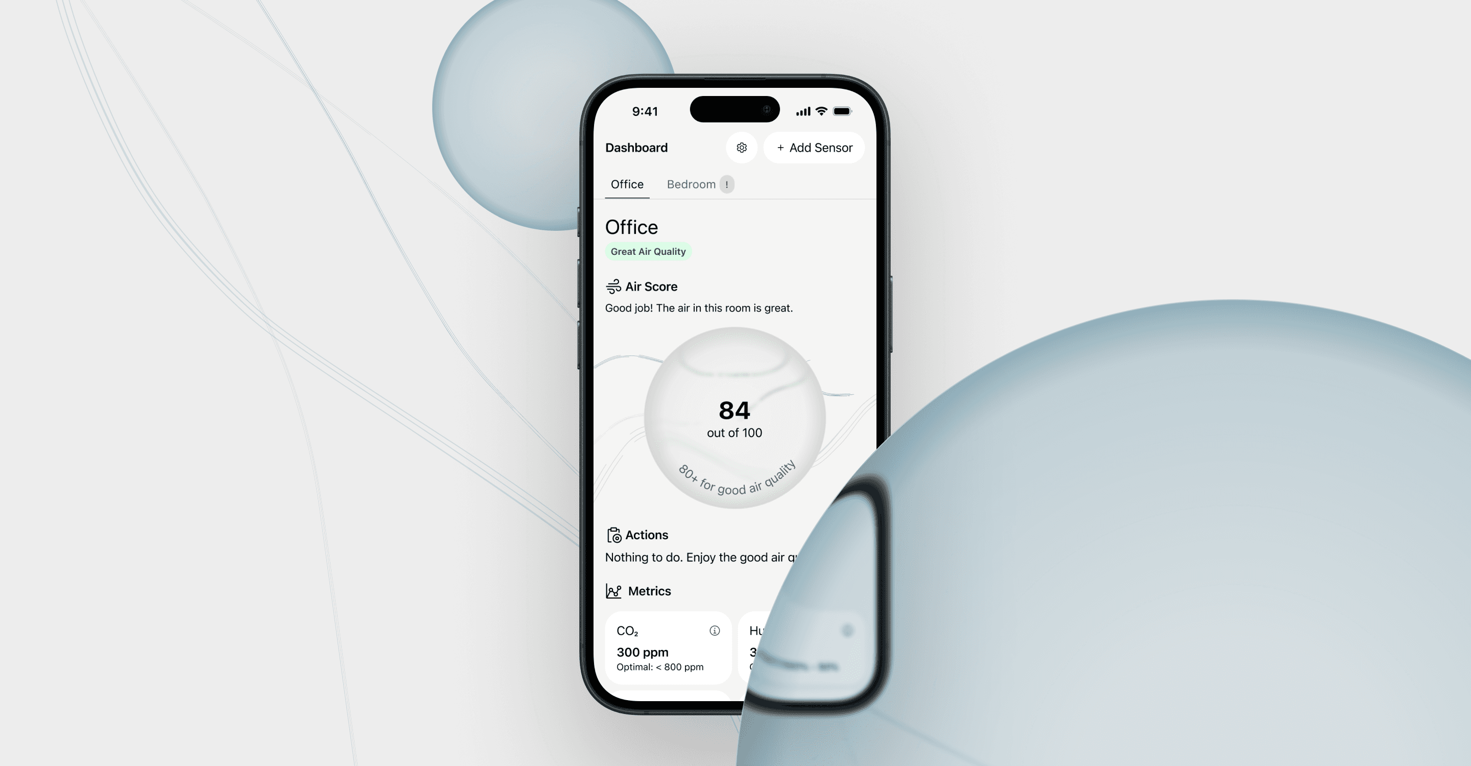
To avoid overwhelming users, I designed a 3-layer system: Layer 1 gives a quick glance for people who just want to know "is the air okay?", while Layers 2 and 3 are there for anyone who wants to dig deeper into the data.


Air Score
Instead of showing multiple raw metrics (CO2, humidity, etc.), I aggregated everything into a single Air Score. It's easier to grasp at a glance, and users can still tap through for the detailed breakdown.

Actionable Guidance
Knowing the air quality isn't useful if users don't know what to do about it. I added a ventilation timer directly in the app, so the next step is always one tap away. No separate research or guesswork required.


The Process
Testing and Iteration
I conducted two rounds of user testing (n=5) to validate design decisions and identify areas for improvement. I decided to conduct a task-based testing with a think-aloud protocol.
Round 1:
Users struggled with abbreviations like CO₂ and TVOC, lacking context for what these metrics mean and why they matter
One user failed to identify the humidifier recommendation as an action, suggesting the button was visually overshadowing the explanatory text
Blue and green colors were not used consistently to indicate positive status, causing confusion
Improvements based on round 1:
Added metric explanations
Redesigned action cards with clear hierarchy: Problem → Explanation → Action
Standardized color system
Increased visibility of analytics access
Round 2:
Significantly improved task completion
Users immediately identified all recommended actions
Color system was immediately understood.
Users accessed metric tooltips when needed
Users relied primarily on Tier 1 (Air Score) for quick tasks, validating the progressive disclosure approach
Early Concepts I Dropped
Initially I wanted each metric to be visualized with it’s own graph. While this might help users to evaluate individual metrics, I realized it would make the overall UI too busy.

Something similar happened to the Air Score system. First drafts showed all 4 metrics in the same circle, to visually explain the logic of the air score. I dropped this concept and came up with the more simplified circle style.
Furthermore, the Air Score circle was colored blue to visually indicate clean air. Users experienced this as a inconsistency in the use of color and reported to be confused by it. As a result, I changed the color to a more cohesive green to focus on system understanding.
Project Impact
Users
Testing demonstrated that all major pain points users had with competitor apps were solved
All users indicated they would use the app
Visual design was perceived as very positive and users mentioned they like the app over other apps they previously used
Business
While this project was a fictional product design exercise, I believe that my solution provides a good starting point for development and further improvements as well as a scalable part of their product lineup. In terms of revenue, the app could either be deployed alongside full priced sensors as an integral part of the product or monetized through a subscription, premium analytics, smart home integration. Furthermore, I implemented a “buy humidifier” button that could increase revenue by generating affiliate sales or boost sales of the company’s own products.
Business goals and user needs need to be balanced and I believe a good product should be monetized in a way that is not taking away from users but by delivering value.
What I Learned
Actionability drives engagement
Users didn't just want data, they wanted to know what to do with it. Adding the ventilation timer was the single change that most improved how useful people found the app.
Small details matter
Issues like color inconsistency and button hierarchy seemed minor, but significantly impacted usability. These were problems that testing revealed. Design review alone wouldn't have caught them
User testing changes your assumptions
Round 1 taught me that what I thought was intuitive wasn't. Round 2 confirmed the fix worked.